
As an inbound marketing agency, we know the difference that the right inbound marketing website designs make.
Throughout the whole inbound marketing methodology – social media marketing, content marketing, lead capture, email marketing, customer retention strategies – it’s still your website that stands head and shoulders above the rest as your single most important marketing tool in your repertoire.
The reason is simple – all else points to your website.
Regardless of where and how a prospective new customer first encounters your business – through a tweet, an infographic being shared on Facebook, a LinkedIn post, a blog post, a search on Google, a recommendation from a colleague – they will always validate your existence and draw their most influential conclusions by paying a visit to your website.
And so, first and foremost, your site has got to look the part. The colours, the images, the copy, the navigation menu – all of this has to make a great and lasting first impression. It must also have a modern feel, and be optimised for all screen sizes and all browsers. Anything less and your visitors will run a mile immediately.

These are the very basics that you must get right. But, more importantly, when it comes to inbound marketing website designs, the whole site must be built in a way that intuitively – almost invisibly, in fact – guides your web visitors towards the actions that you want them to take.
A new visitor is at the very top of your inbound marketing funnel. But, as every inbound marketing agency knows, ToFU visitors are still a long way from becoming paying customers. And this is where inbound marketing website designs come into play. Your number one job is to generate leads – you don’t make sales without leads, and so your site must direct visitors towards your most valuable content for lead generation.
This content will be designed to educate your visitors on the benefits of your solution. It is what you will use to capture those all-important email addresses so that you may subsequently make personalised contact with prospects and nurture them through the buyer’s journey. Inbound marketing website designs are all about offering plenty of conversion opportunities, about personalisation, about content, and about ensuring that the site is about your customers first before it’s about you.
So, let’s take a look at some examples of some of the most impressive inbound marketing website designs to give you inspiration.
3 of the Most Impressive Inbound Marketing Website Designs
1. Shakr
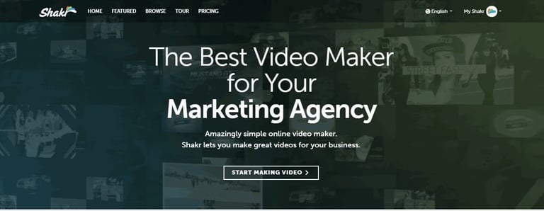
Here’s a great looking homepage from video making platform provider Shakr.
Everything you see here is above the fold – and what more could a first-time visitor possibly need to know?
What’s particularly impressive about this inbound marketing website design is how Shakr has found a way to make their homepage about all the businesses that they want to attract, instead of just being about them. And they’ve done it very simply with a slider heading – “The Best Video Maker for Your Marketing Agency [slide] Digital Signage [slide] E-Commerce Store [slide] Real Estate Business [slide] Online Ad Campaign [slide]…”
Below this, with just two very simple lines of copy, the solution is explained clearly and concisely: “Amazingly simple online video maker. Shakr lets you make great videos for your business.”
Again, the last words here are “your business” – it’s not about Shakr, but about you.
Then, to make it clear just how “amazingly simple” it is to get going, the CTA is right there above the fold, too: “START MAKING VIDEO” in capital letters.
This very simple design tells you everything you need to know in an instant – and you’re prompted to get started straight away. However, if a visitor wanted a little more information, the menu bar is right where you expect it to be, offering a tour, the opportunity to browse the site, and a link to pricing information.
This is one of the great inbound marketing website designs – and that slider in particular showcases how you can very simply configure your homepage to directly address many different categories of prospects in an instant.
2. Evernote
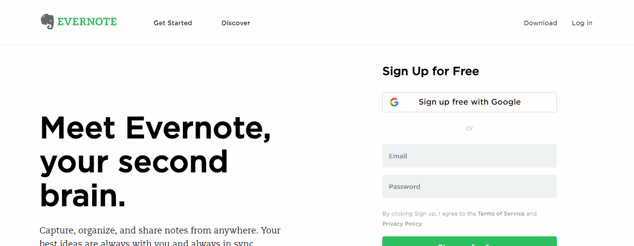
You don’t have to keep everything above the fold.
The Evernote homepage uses a visual hierarchy, so that the most important thing that the company wants you to do (“Sign Up for Free”) is right at the top, then, as you scroll down the page, visitors are presented with various other CTAs enticing them to take other actions.
Notice, too, how social sign-ups are enabled with Google – if you’ve got a Google account (who hasn’t?), then signing up is as simple as a single click.
The first headline immediately humanises Evernote, giving it character, while once again making the solution about you, the customer – “Meet Evernote, your second brain”.
Then, as you scroll down, the design makes great use of white space ensuring that each mini sub-section is given the weight it deserves and simply can’t be missed: “Remember Everything”, “Work Smarter”, and “Bring it All Together”. Three headings and we’ve learned what we’ll get by signing up to Evernote (as opposed to the focus being on what the Evernote solution itself is all about).
Beneath each of these headings is a CTA that either prompts visitors once more to sign up to a free account, or otherwise to check out Evernote for business. And this is all very important for inbound marketing website designs – the crucial thing is to drive visitors to take action. Evernote does this with simplicity and grace.
3. HubSpot
As one of the most prominent inbound marketing solution providers in the world, you’d expect HubSpot to be showcasing a great inbound marketing website design to match – and that’s exactly what it does.
HubSpot, however, takes a slightly different approach to the two previous examples. Here, it wants to explicate the HubSpot solution, as opposed to placing the focus on who it is that would most benefit from it.
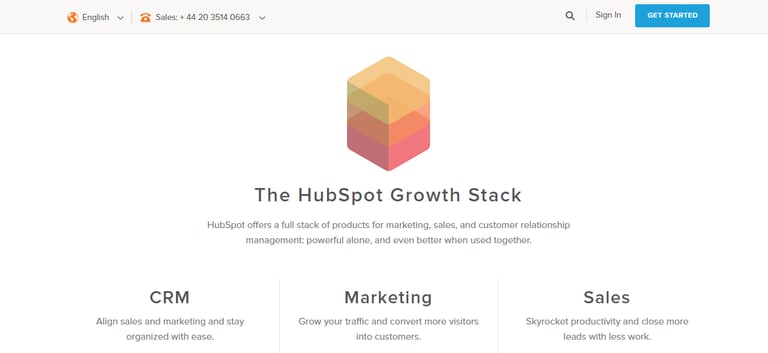
Just below the fold is “The HubSpot Growth Stack” where every business can see that HubSpot offers everything a business or inbound marketing agency could possibly need to start improving their marketing and sales efforts.
A crisp and clean design, three CTAs stand prominent – CRM, Marketing, and Sales. Clicking on either guides visitors to educative content that explains how each product in the stack can be used to help grow their business.
And no matter how far up or down a visitor scrolls, they are followed by the scrolling bar at the top, which is complete with contact number, and of course the beautiful blue “Get Started” CTA, so visitors need never worry about locating the page they need to get started with HubSpot.
Simplicity, once again you will notice, is key to this inbound marketing website design, and the focus is on education and prompting visitors to take action.
Over to You
Great inbound marketing starts with great inbound marketing website designs. Your website is your most important inbound marketing tool by far, and its design will make the difference between the skyrocketing of your bounce rate and your conversion rate.
If you need help with your inbound marketing website designs, then don’t hesitate to get in touch with the inbound marketing experts here at Incisive Edge today.