
If you’ve already been trying to convince web visitors to sign up for your SaaS trial, then we're sure you’ll agree with us on this:
Getting them to hit that signup button is not a small feat.
After all, driving tons of traffic to the site is relatively easy, particularly if you can afford to use paid advertising.
Convincing visitors to try your product, now that’s a different story.
But as it turns out, poor conversions are often a result of just a handful of mistakes that prevent potential users from signing up.
In this post, we'll identify common conversion mistakes and provide actionable solutions to boost your SaaS trial sign-ups. As well as optimizing your site's conversion rate and emphasizing the desired action, so that you will effectively begin increasing conversions and achieve better results.
Check out the following blogs to learn more about Conversion Rate Optimisation
- Top 3 Tactics to Supercharge Your Website Conversion Today
- 3 Great Design Tips to Increase Website Conversion Rate
Mistake 1. Offering a Weak Call to Action
Did you know:
90% of web visitors who read your homepage headline will also read the call to action.
Crazy, huh?
Particularly, if you consider how few of them actually act on it.
But as our friend Joel Klettke puts it (note, the emphasis is ours):
“Calls to action are hyper-critical to the conversion process, and incredibly easy to get wrong.”
For one, you might be displaying a weak CTA that fails to inspire your visitors to act. Here are a couple of ways how this might happen:
Your CTA Doesn’t Build a Personal Connection With a Visitor
Take the most common CTAs like “Submit” or “Signup” as an example. Although they clearly indicate the action a person should take, they’re difficult for a person to relate to.
When writing your call to action, try to connect with the person you’re trying to convince to sign up. As Joanna Wiebe writes in this piece on Copyblogger:
“A great rule of thumb when writing a call to action is to make your button copy complete this sentence:
I want to ____________”
And then, use whatever copy you’ve used to complete the sentence as your CTA.

You Confuse Visitors With Too Many CTAs
We're sure you’ve heard about the paradox of choice theory. It says that when we’re faced with too many options to choose from, we simply decide not to take any action at all.
As a rule, your website should aim for conversion rate optimization by focusing on one specific action that you ask the website visitors to take. Adding multiple calls to action can lead to decision paralysis, causing visitors to struggle to choose an action and potentially leave your site. To enhance conversion rates, it is crucial to create effective landing pages that guide visitors towards the desired action.
You Don’t Make the Call to Action Stand Out Enough
Ensuring your web page garners visibility for your CTA is crucial for driving clicks. Consider this example: we've prominently marked the CTA on the page. However, without this clear indication, would you have still noticed it? To optimize click-through rates, implement effective conversion rate optimization strategies and take into account user behaviour. By doing so, you can enhance your web page's visibility and increase the likelihood of visitors clicking on the CTA.
Our guess is, no. At least, not without analysing all the elements on the page first.
Using the same colour scheme as the rest of the page has made the CTA blend in with the rest of the content, making it almost indistinguishable without digging through the page. This lack of contrast can hinder conversion optimization efforts, as it becomes challenging to calculate conversion rate accurately. To improve the effectiveness of the CTA and enhance conversion optimization, it is essential to calculate conversion rate and consider the target audience when making design adjustments.

To make your CTA stand out on a page:
- Use contrasting colors
- Make the CTA button big so that it draws attention to itself
- Leave space around it to prevent it from blending with other elements

Mistake 2. Asking for Too Much Information
Tell us:
How much time do you think it should take for a visitor to sign up?
Well, let us help you out with this one.
The answer is, as little as possible.
You see:
Signing up for a trial is often an impulse decision.
The overall process generally unfolds as follows: an individual discovers your SaaS product through an effective conversion rate optimization process, which aims to increase conversions and boost existing website traffic. They may already be familiar with your brand from various social channels thanks to your well-executed digital marketing strategy. Intrigued by the compelling value proposition, they make an impromptu decision to try out your product, benefiting your e-commerce site. This entire journey is facilitated by the use of Google Analytics, allowing you to analyse their behaviour, track their interactions, and measure the impact on increasing conversions, site visitors, and customer acquisition costs.
But you can easily obstruct that process by placing roadblocks on the person’s journey.
And the most common roadblock of them all is asking for too much information during sign-up.
Here, there’s even research to prove it:
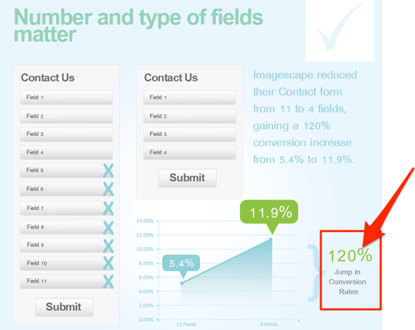
Dan Zanzarella discovered that conversion rates go down with every new field you add to the signup form.

Unbounce reported a test in which shortening the sign-up form resulted in a massive 120% lift in conversions.
So, when designing your conversion forms, ask for only the most important information that you absolutely need to know.
And in the case of SaaS sign-ups, this typically means a person’s email and optionally, a password they want to use to log in to their account.
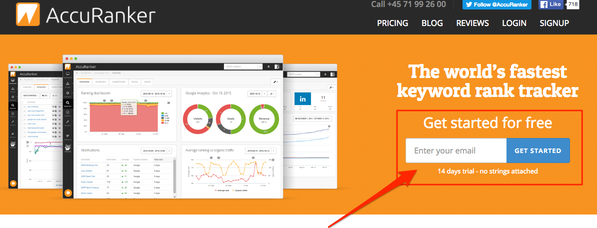
Accuranker requires you to fill in only one form – email – to sign up for a trial.
Mistake 3. Not Displaying Social Proof
Which option sounds better to you?
A SaaS product that can help you overcome your problem…
…or a SaaS product with thousands of satisfied users that can help you overcome your problem.
Stupid question, right?
You’d obviously prefer a product thousands of people have found valuable. There’s absolutely no doubt about it.
And that’s because, we often seek and use social proof to validate our choices, particularly when we’re unable to make a decision.
Social proof is a trait of our behavior that typically activates when we're unsure about what to do. We overcome this by imitating the behavior of others, assuming that it is correct for a given situation. In the realm of online marketing, conversion rate optimization (CRO) focuses on improving the performance of a landing page and enhancing the conversion funnel.
A number of psychological experiments have proved social proof’s existence and influence on us. Many of them are listed in this guide to social proof.
But the most important aspect of social proof is that you can (and should) use it to convince visitors to sign up for your trial.
Displaying Social Proof Close to the Sign-Up Form:
- Builds trust in your business
- Adds credibility to your product
- Helps a visitor to validate the decision to sign up
- Simplifies their decision-making process
There are many ways to include social proof in your sign-up process. Here are the most common ones SaaS companies use:
Including data or stats from your users. Freshbooks’ call to action features a convincing statistic from their users.

Accuranker lists the number of their happy customers.

Showing testimonials. Cultured Code displays a Twitter feed with messages from users satisfied with their product.

Displaying client logos, press mentions, and other peer validation data. Helpscout displays some of their customers right below the call to action.

Beacon combines the number of customers with testimonials to offer a compelling social proof to potential users.

Mistake 4. Failing to Prove Your Expertise
Look, there’s no point beating around the bush here:
Your potential users have many other choices apart from your product.
And even if you do everything right, such as writing a powerful call to action, making it prominent, and backing it up with strong social proof, your website's conversion rate may still be low, indicating that visitors are more likely to sign up for your competitors' trial. Utilizing conversion rate optimization tools can help analyze and improve your website's conversion rate.
And that’s because you’ve failed to prove your expertise.
Just consider these stats:
According to the 2014 state of procurement study by Accenture, 94% of B2B buyers report that they conduct some form of online research before purchasing a business product.
They’ll scour Google, but they'll also read your website and blog articles looking for information that will help them decide whether or not to sign up for your product.

In fact, for the most part, they’ll want to conduct all the necessary research on their own. As many as 31% will not want to talk to you during that process (but might need some phone support if they come across issues they can’t solve). And 10% will not want any involvement from you at all.

So, how can you meet those expectations?
First, establish yourself and your company as thought leaders by publishing useful content your audience could use to overcome their most immediate challenges.
Then, expand your content strategy across other channels to target your potential users’ interest and spark a decision to try your product.
Conclusion
Getting potential users to sign up for a trial is getting more challenging by the day. But as it turns out, poor conversions are often a result of just a handful of mistakes that prevent potential users from signing up.
Luckily, eliminating those delivers an almost instant lift in conversion rates.