
Much of the conversion game for SaaS companies comes down to the all-important SaaS CTA. At our inbound marketing agency in London, we’ve helped many SaaS companies in the city and around the world develop their inbound marketing campaigns from the ground up. But if there’s one thing we’ve learned, it’s that a weak SaaS CTA can make all other inbound efforts practically redundant – for, when all’s said and done, if no one clicks that button, you’ve got no new customers coming on board.
The SaaS CTA – or call-to-action – is the button that forms as the gateway between one stage of the conversion funnel and the next. Your inbound marketing agency will ensure that you have a strategy in place that draws targeted prospects to your website, captures their contact information, and educates them about the benefits of your SaaS solution. But what it can’t do is reach out a hand from the computer screen and physically click that CTA button on behalf of your prospects.
The button has to make prospects do that themselves.
It seems like too small a thing to have such power – but the truth is that it’s very possible that your SaaS CTA could be the cause of all your conversion rate problems. Just one SaaS CTA mistake could lose a potential lead in a matter of seconds – and there are a lot of seconds ticking by each and every day.
Below, we’ve put together a list of five of the biggest SaaS CTA mistakes to avoid at all costs.

5 of the Biggest SaaS CTA Mistakes to Avoid
1. No One Can See It
And if they can’t see it, who’s going to click on it?
Nobody.
So, first and foremost, it’s essential that your SaaS CTA button is visible “above the fold” of the page – i.e. visible before you have to scroll down.
However, it’s not just the CTA that must be above the fold, but all the most crucial information that will entice people to click on it, too. The reason being that if this info is below the fold, as the visitor scrolls down the page to consume it, the CTA button floats up and out of sight (and potentially out of mind).
Here’s a good one from Leanplum. There are in fact four CTAs on this page – ‘Try it now’, ‘View use cases’, ‘Watch the video’, and ‘Sign up’ up in the corner. Notice, too, how all the information is above the fold, and, if you need to know more, you can always watch the video or check out some use cases. This is a good example of a landing page that makes great use of design for some enticing SaaS CTAs.

(Image source: unbounce.com)
2. You Ask for Too Much Info
If there’s one thing almost guaranteed to put off potential sign-ups, it’s making your sign-up form too lengthy.
Do you really need to know where each sign-up works, what their job roles are, their middle names, their phone numbers and inside leg measurements?
Let’s put it another way – do you really need to know all of this stuff at the expense of losing potential customers who don’t have the time to tell you about it?
A lengthy or complex conversion process simply equates to a low conversion rate. When it comes to the SaaS CTA, you will only entice clicks when you keep interference with what prospects are doing (i.e. signing up to your service) minimal. Here at our inbound marketing agency in London, we’ve learnt that the time to ask for detailed information is at the end of the sales funnel – not at the top of it.
Codecademy have got it right – all you need to do is give them your email address, then create a password and a username and you’re good to go.
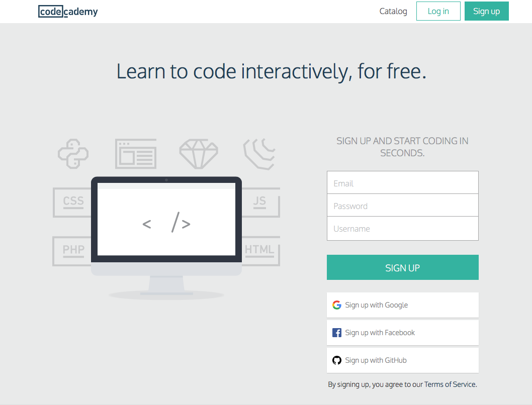
(Image source: codecademy.com)
Also, to make the sign-up process even easier, notice how visitors have the option of signing up with Google, Facebook, or GitHub. Social sign-ups make conversions a one-click process – and research has found that 77% of web users believe it to be a good option.
3. It’s in the Wrong Place
“Is there really a ‘wrong’ place for a SaaS CTA?” we hear you ask.
Well, according to the Guttenberg Rule, visitors to your web pages will follow the Western habit of reading left-to-right, top-to-bottom.
This means that people will view your page in a particular pattern, and that there is a certain place on your page – the bottom right, known as the terminal area – where users will look last. By placing your SaaS CTA in the terminal area, studies show that more clicks will be generated.

(Image source: uxmovement.com)
Users will look first to the primary optical area, where the main headline of the page should be. Then their eyes move to the strong fallow area – a good place for some supporting text after users have read the headline. The best spot for an image or video is in the weak fallow area, for, according to the Guttenberg Rule, users won’t place very much importance upon written content in this area, but will absorb an image at a glance. Finally, by placing the CTA in the terminal area – where users naturally end their viewing pattern – no one has to look around for it (and by this time they will have taken in all the information you’ve provided and hopefully be encouraged to click).
UX Movement provide the following example to help you visualise the pattern in application.

(Image source: uxmovement.com)
4. It’s Too Small
Size matters when it comes to the SaaS CTA.
Some SaaS companies can be a little tentative about having a large CTA, perhaps fearing that it might come across as too in-yer-face or aggressive. However, as any inbound marketing agency worth its salt will tell you, the CTA button is the most important feature on the page – so it’s imperative that no one misses it.
Here, Dropbox keeps things nice and simple. Only three form fields to fill out, a social sign-up option, and a large, bright blue CTA button in the terminal area – can’t miss it.

(Image source: dropbox.com)
5. The Copy is Too Vague
People need to know what they will get when they click a CTA button – and so the copy needs to communicate this.
Vague copy, such as “click here” or “submit”, doesn’t really tell people very much – and it’s not particularly enticing, either.
Your SaaS CTA copy should clearly communicate the benefit of clicking the button. It should also be attention-grabbing – and using words such as “Free”, “My” and “Now” is a good way to do it.
Think in terms of “Start my free trial now”, or “Register instantly”. This creates a sense of urgency and prompts users to act quickly.
Here’s an example from FreshBooks. Note the social proof next to the CTA – “97% of small business owners recommend FreshBooks”. That adds a little extra enticement to the proposition.

(Image source: freshbooks.com)
Over to You
The SaaS CTA is one of the most important – if not the most important – thing to get right on your landing, home and sign-up pages. It needs to be clear, bold, large and enticing, and can’t be hindered by complex forms asking for too much information. Your conversion rate depends on getting your SaaS CTA right, and so the button needs your time and dedication to ensure that it does its job properly.
If you need help creating a high-performing SaaS CTA, get in touch with Incisive Edge here at our inbound marketing agency in London, today.