If you want to generate leads, you’ve got to have calls-to-action (CTAs). That’s the plain and simple truth of it.
There’s no hard and fast rule about what the particular action that you’re instructing your visitors to carry out should be. It’s going to depend on a lot of things, like where they are in your marketing funnel, the industry that your business is in and the kind of product or service that you provide.
You might be asking visitors to download an ebook or white paper, sign-up for a trial, request a call or even just straight-up buy your product (and why not? You know it’s brilliant.)
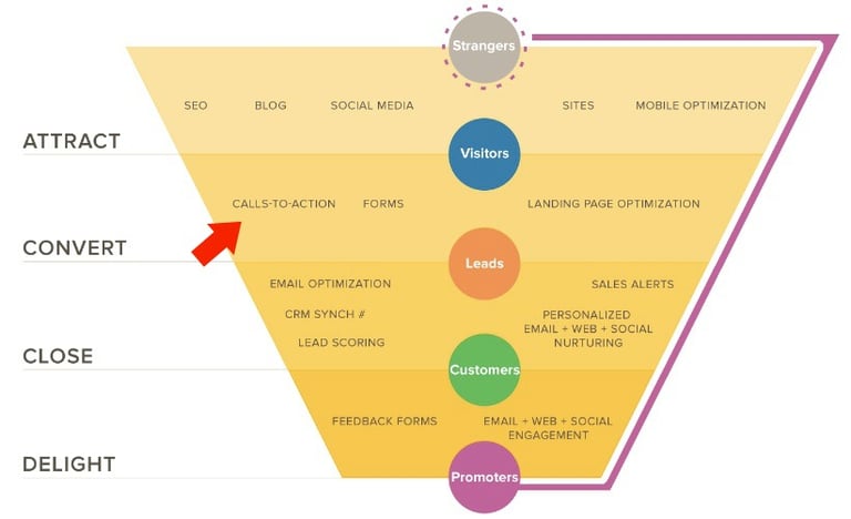
Ultimately though, a successful CTA always has the same outcome; Conversion. (As shown in the diagram from HubSpot above.) Translation: You capture a visitor’s information and generate a fresh lead.
There are three distinctive components to a CTA. The design, the button copy and the CTA position. In this post, we’re going to take you through each component and identify some of the best practices that help make your CTA attractive, functional and high-converting.

Sitting Pretty
An eye-catching CTA is an effective CTA. It doesn’t need to be complicated, it just has to look good and draw some attention to itself. There’s a few different aspects to consider when it comes to making an attractive CTA.
Shape
CTAs are always buttons. Don’t try and hyperlink a line of text and call it a CTA. It isn’t a CTA!
People are familiar with the structure of buttons and instinctively know that they are both clickable and have some kind of effect.
If you choose this opportunity to unleash your creativity and design a CTA that’s a GIF of a kitten playing with a ball of string, prepare to be disappointed. We can tell you with some certainty that it’s definitely not going to convert.
If in doubt, keep it simple. This one from the Moz homepage is a great example.
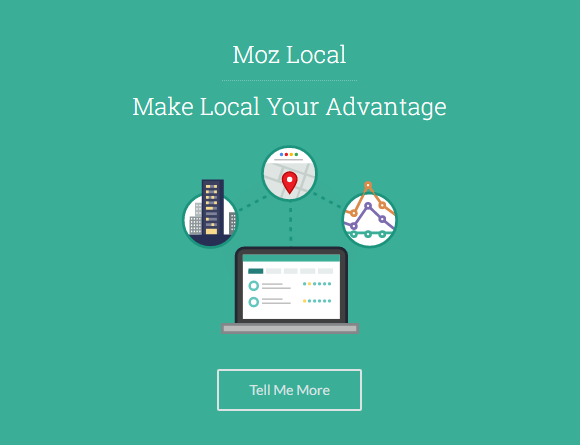
The graphic design of the background is attractive but the button itself is as basic as can be. Just a plain rectangle.
Rectangles with curved ends or corners are also a popular choice. Circles are less common (and for good reason), but not unheard of.
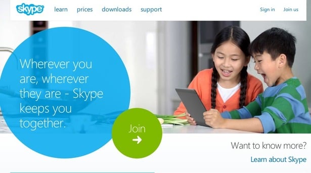
Interestingly, Skype retired this particular version of their homepage a while ago. Hmm… We guess the circle wasn’t doing so well.
Colour
There’s a bit of debate surrounding what exactly is the “best” colour for a CTA. Some people claim that red can seem aggressive and is a “stop” sign for some visitors, but we generally find that so long as your colour is distinctive, it stands a good chance of converting.
Internet browser Firefox does this really well.
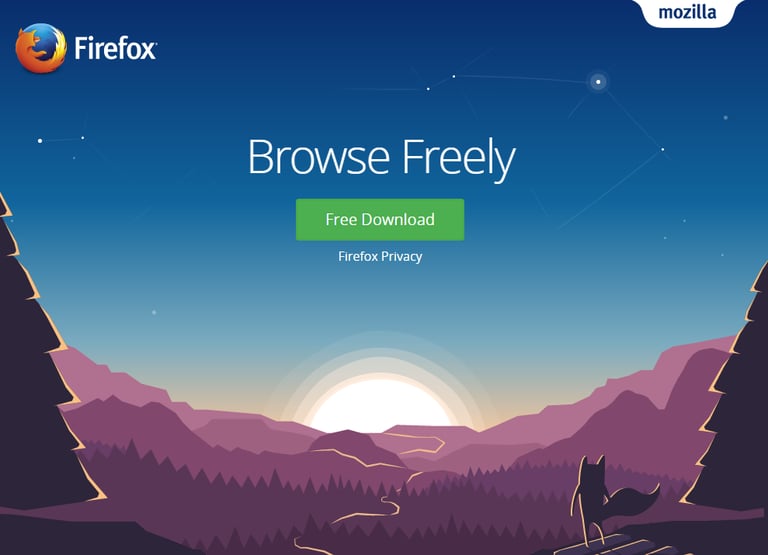
There isn’t a speck of green anywhere else on the page, so the eye is instantly drawn to the button. In fact, there’s a whole lot pointing you to this particular CTA. Even the titular Firefox himself seems to be gazing up at the CTA.
Well-played, Firefox.
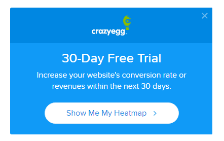
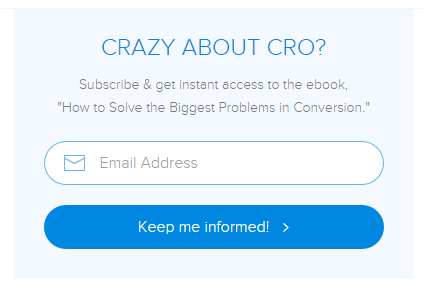
The two CTAs below from CrazyEgg are decent examples. The colour of the buttons are in keeping with the theme so they tend to blend in a bit more, but the contrast is enough to make them effective.
If you ever find yourself questioning your colour choice when trying to design a CTA, try the “highly technical” squint test. Make your button in a couple of different colours, put them side by side, take a couple of steps back and squint at your computer screen. (Very technical, we know.)
One colour should be sticking out more than the other. That version of your button is probably the one to go for.
Bells and Whistles
To really get your CTA standing out, you might want to jazz it up with a little something extra. Drop shadows are very common, as are arrows. The sky's the limit here, but we would encourage some restraint.
The image below shows some examples of how calls-to-action can be made a little more unique.
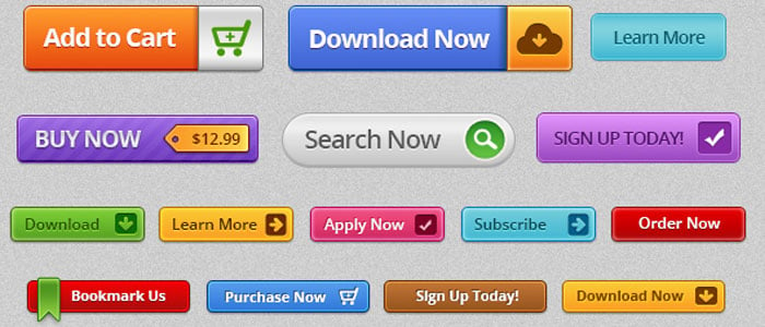
The key here is just to make sure it’s appropriate and makes sense for the action you’re instructing your visitor to carry out.
Okay, so now you’ve got your design nailed down. The shape is simple, the colour is crying out for attention and you’ve even got a fun little icon on it. What’s next?
Become a CTA Wordsmith
Some people swear up and down that the words on and around your CTA are the most important factor in its success. And we’re inclined to agree.
It’s here that you get to;
- Tell people what action you want them to take
- Tell them what they can expect in return
It’s essential that you communicate this in a very clear way and use plenty of persuasive language to coax them into clicking that button.
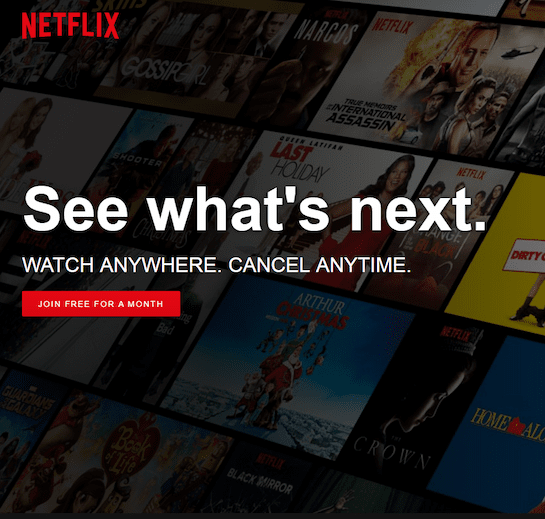
Netflix’s CTA copy is pretty much perfect.
A lot of people worry that they’re going to be roped into a paying subscription with a complicated cancellation process when they sign up for a free trial. Netflix managed to quell this fear right up front and create a seriously compelling CTA.
They’ve also used the one word that never fails to get people excited.
“FREE.”
We love a freebie. Everyone does. If you can honestly get it into your copy, you’re on the right track for a high-converting CTA.
You also need to keep it short.
We’d suggest no more than five words. North of this and it starts looking more like a text box than a button. This goes double for spreading your CTA copy over two lines. It loses all its impact.
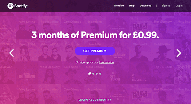
Spotify is another company nailing their primary CTA. They even include a further link underneath for the free version of Spotify just in case you aren’t yet ready for their premium service.
If they’d made a button for their free service it would detract too much attention from the main objective: get people to pay for premium.
They’ve also got an awesome offer for new customers. The service is usually £9.99 per month, so this is a massive discount. It’s much easier to convert a trial user than someone who’s never tried your product, so this is a great method of increasing their customer base.
You could also try switching to first person text.
So if your button currently reads, “Download Now” you could try, “Download My Free Ebook.”
It might take a while to get your head round writing as a lead rather than as a marketer, but it could pay dividends!
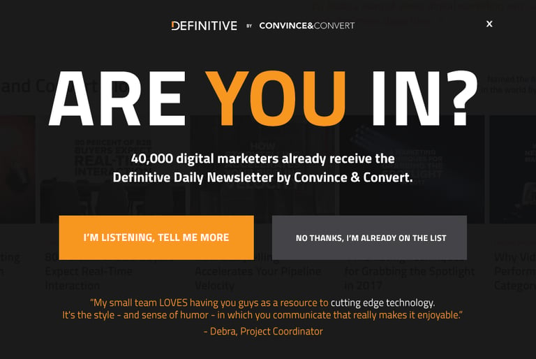
This is a seriously impressive example from Convince and Convert. This particular CTA appears as you’re about to click away from the site.
It’s got a quick testimonial, social proof in the form of statistics on who’s signed up to the newsletter and a bright, personal CTA on the left.
The button on the right is distinctly unappealing. Sludge grey, negative, and you might be lying if you click on it, which just doesn’t feel nice.
Everything on this page points you towards the CTA, which is exactly what your copy should be doing when it comes to designing your own.
One other thing that might push your CTA from good to amazing is creating a sense of urgency. It might not necessarily be a limited-time offer (though these often do really well) but you can encourage an action with words like “exclusive,” “secret,” “now” and “today.” And phrases like, “don’t miss out.”
People can’t resist the feeling they’re getting something special and hate being left out. You can use this to your advantage.
Location, Location, Location
So it’s looking good. It’s a nice distinctive colour and you haven’t tried to reinvent the wheel with your button shape. It’s also got some really compelling surrounding copy and think you’ve pretty much nailed the button text. Now it’s time to figure out where it’s going on the page.
The most important thing by far is that the CTA has to be in a logical place. If all your copy is in the centre of the page, don’t then go and shove your CTA in a corner.
People will rarely go out of their way to look for your CTA. It needs to be as seamless an experience as possible. This means minimal effort and little to no friction.
The award for one of the least inspired CTAs we’ve ever seen has to go to Apple. The copy is almost non-existent and the positioning isn’t very intuitive at all. In fact, all it has going for it is the blue colouring.
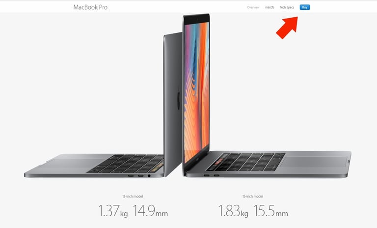
Of course, when you’re Apple, you don’t need to do much at all to have people scouring your site for the “Buy” button.
Unfortunately, you probably won’t have the same luxury.
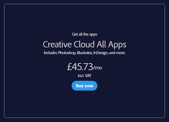
This one from Adobe makes much more sense. You’ve got all the info available up front and you have the slightly more enticing “Buy now” to really seal the deal.
Conclusion
With this guide, you should now have everything you need to start converting visitors like never before with great-looking, intelligent and intuitive CTAs. Get started today with Incisive Edge and see your campaigns convert like never before!.
