With this blog, you will learn about some tips to increase your website conversion rate.
If you want to improve your website conversion rate, then you need to build it with the principles of inbound marketing website design at the forefront of your mind.
Website design and the graphic design involved play an extremely important role in guiding visitors down you inbound marketing funnel. Traditional website design has historically placed heavy focus on the business that it represents – its people, its history, its products, even the building in which the business is housed.
However, since the explosion of inbound marketing over recent years, what web designers and marketers alike have come to realise is that visitors don’t really care about the view you enjoy from your office windows. And they’re not really interested in where your CEO studied at university either. In fact, it’s not even the exact nature of your products or services that your visitors are interested in – at least not on the first visit.
No, what most of the first-time traffic to your website really cares about is whether or not you can help them. To put it another way, these visitors have a problem and are here to find out if you can solve it. That is where conversion rate optimization comes into play.
What’s more, they want this information quickly, and good inbound marketing website design ensures that they have it.
What Is the Inbound Marketing Funnel?
To understand why inbound marketing website design is so important, we must take a moment to get to grips with the inbound marketing funnel.
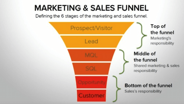
Though more commonly called the “sales” funnel, the truth is that marketing plays a larger role in the buyer’s journey (which the funnel represents) than actual sales. True, nearly all inbound marketing initiatives are designed to drive eventual sales, but the action of making a sale is only the very final stage of the process.
In any case, it looks like this:
(Image source: landerapp.com)
Let’s break it down.
Top of the Funnel (ToFu)
85% of the visitors to your website fall into this category. They are sometimes classified as “learners”, meaning that they are have arrived to learn whether or not you have a solution via a blog post, or something along those lines for their problem – hence why traditional website design, which focuses on the company and pushy sales pitches, are often sub-optimal in effect.
The average conversion rate of most non optimised websites is low. Multiple factors must be optimally in place to increase the likelihood of success. For that, you will need to focus both on inbound, UX, and UI. Your team of graphic designers will need to come up with creative ideas to make navigating on your site a seamless experiences. Design elements like the background image might sound non-relevant but can have an impact on your prospective audience.
Visitors at the ToFu stage are in learning mode – not purchasing mode. So, for starters, it's imperative that your website is designed to present them with helpful and relevant information that will help them find out if you can solve the problem they're facing while also making your stance and value proposition clear.
Middle of the Funnel (MoFu)
These guys represent about 10% of your overall website traffic. They are returning visitors to your website. They’ve done their research, realised that you can indeed solve their problems, and are now weighing up your solution against others that they’ve found.
MoFu visitors will be looking for additional information about some of the finer details about you as a company, what your values are, and your level of expertise. They won’t necessarily be ready to make a purchase today, but are a few steps closer than the ToFu cohort.
Bottom of the Funnel (BoFu)
Making up only 5% of your traffic, BoFu visitors are nonetheless what the inbound marketing game is all about – making sales. These visitors have completed all their homework and have decided that your solution is the best fit to their problem and are ready to spend.
From a design perspective, your website needs to make the process of signing up to your service, ordering a product, or making contact with you directly is as straightforward and as painless as possible.
Improving your Conversion Rate with Inbound Marketing Website Design
Great inbound marketing is all about great content. You can work on your conversion funnel endlessly. However. without great content, you will unlikely achieve the desired outcome. Content not only helps your website get found by search engines, but ensures that your visitors are sharing what you're doin on social media, thusly driving more traffic and enhancing your search engine rankings.
But content also plays a key role in the conversion process. In terms of inbound marketing website design, the content – including text, images, video, and CTAs – you choose to display on your main site pages plays a critical role in capturing leads and making sales.
So let’s look at some great examples of inbound marketing website design that are effective at the different stages of the inbound marketing funnel, and consider what makes them work so well.
Basecamp – ToFu
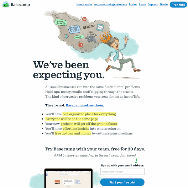
If you’ve been looking for a productivity application that will help you and your team work better together, then you might have discovered Basecamp when conducting your search – and above is the Basecamp homepage you’ll be met with.
So what do you immediately learn as a ToFu visitor in “learning mode”?
Well – pretty much everything. Note the highlighted text explicating not what Basecamp is, per se, but rather what you’ll get by signing up.
At a glance, you know immediately whether Basecamp will be able to solve your problem or not – and that’s exactly the type of information that ToFu visitors need.
Below this is the call to action (CTA), oiling the cogs of this conversion-driving machine. We’ve got the usual “Try it for free” message, but what’s particularly good about this page is the fact that it bundles social proof right into the CTA – “4,754 businesses signed up in the last week.” It builds trust immediately, and that subtle green arrow just beneath the call to “Join them!” actively directs visitors towards filling out the all-important form, literally pointing them in the desired direction.
But if that isn’t enough, the navigational menu at the top of the screen where we can find out “How it works” or more about the “100,000+ paying customers” is clear and exactly the sort of information a ToFu visitor would likely need before taking the plunge.
All in all, a great example of inbound marketing website design.
HubSpot – MoFu
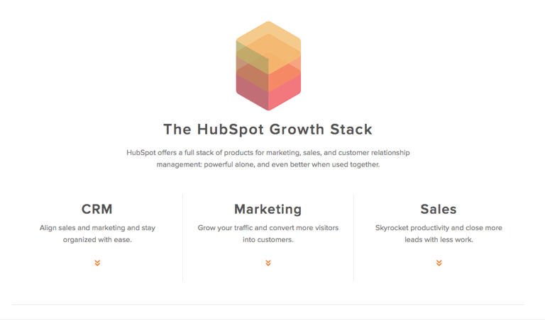
When visitors are at the MoFu stage of the inbound marketing funnel, they are going to be after plenty of additional information about the products or service that you’re offering.
HubSpot presents much of this information on its homepage – though is careful not to overwhelm visitors with too much, and so presents plenty of links which people can use to go to pages where they can learn more.
The screenshot above is taken from a segment just below the fold of the HubSpot homepage. Note the clarity of the design, the economy of wordage, and those enticing little red arrows that do not intrude, though are nonetheless unmissable.
The inbound marketing website design of this segment reveals a nifty trick. The HubSpot solution is in fact quite large and powerful, and so there’s lots of information that needs to be communicated. By clicking on those arrows, the user is automatically zoomed to the corresponding part of the homepage where they can find out more. For instance, when you click on the “Marketing” arrow, the page scrolls down to this section:
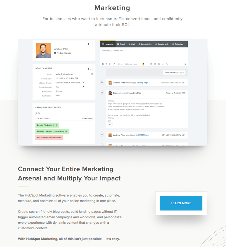
Although it appears static in the screenshot, it’s not an image but in fact an auto-play silent video that starts rolling just beneath the “Marketing” heading.
And that’s great inbound marketing website design in itself. Great because it shows the solution in action, but also because of the silence – MoFu shoppers still don’t want too much in-yer-face content.
The “Learn More” CTA is bold, and clicking on it takes visitors to a page where this part of the HubSpot solution is delved into more thoroughly. Furthermore, a chat window opens where prospects can start to ask questions, and HubSpot can capture and identify marketing qualified and sales qualified leads (MQLs and SQLs).
A great example of MoFu design.
Box – BoFu
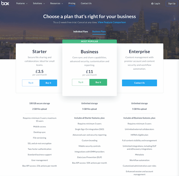
Now we’re at the bottom of the funnel, the inbound marketing website design area to focus on is of course the pricing page.
The above screenshot is the offering from Box, and we chose it as it does a few things really well.
For starters, it allows users to choose their own inbound marketing persona by offering two price lists – “Individual Plans” and “Business Plans”. This makes the whole experience for the user very straightforward – businesses don’t need to see the pricing plans for individuals, and vice versa.
The next thing that literally pops out of the page is the option that Box really wants you to choose – “Business”. All subscription services tend to know what their most profit-maximising option is, and so it’s important in design terms that this is presented with the most prominence.
Box have designed theirs so that it appears to be actually lifted above the others, using a little shadow to create the hovering sort of effect. It’s also clearly labelled as “Most popular”, again, encouraging clicks.
Importantly, all features are listed clearly, and the option to “Try it” is still made available, though the “Buy it” CTAs are the most prominent.
It’s all very neat, and further information can be gathered by clicking on the “View Feature Comparison” link. Great BoFu inbound marketing website design right here.
Back to You
Website design is fundamental to driving conversions. You will need your site to be optimised for mobile users, and your graphic designer to focus on creating graphics that are enticing to your audience. Having the graphic elements perfect is something that shouldn't be understated. Traditional design no longer cuts the mustard – today, it's an inbound marketing website design that results in positive user actions and guides visitors down the inbound marketing funnel. Use the examples above to inspire your own inbound marketing website designs and turn your site into a conversion-driving machine.
If you have any further questions about inbound marketing website design or would like to know anything more about any of our services, get in touch with the inbound marketing experts at Incisive Edge today.
