Remarketing (also known as Retargeting) is a tool that targets advertisements towards internet users who have already visited your website. These visitors are nurtured back to your site with a personalised retargeting ad when they browse other sites on the internet.
96% of visitors will leave your site without making a purchase on the first visit. And since remarketing banners have a 76% higher click rate than non-targeted ads, it’s a highly-effective method of enticing back an audience who have already shown an interest in your products.
Banner ads have proven to be one of the most reliable ways to capture the audience you once lost. Good remarketing campaigns will provide the right information to the right audience in the right place.
Remarketing is a cookie-based technology, embedding an invisible piece of code, or “pixel” onto the visitor's browser. A banner ad is usually shown somewhere on the web page a user is visiting.
This pixel then follows them as they surf the web, allowing remarketing software to reflect their previous interactions with your site. As a result, you can deliver highly personalised ads, such as reminding them of a particular product of yours that they had been viewing.
Whether your platform is Google ads, Facebook Ads or any other, you'll have the ability to conduct a remarketing campaign. Just make sure you research your Google analytics and study the behaviour of your customers and potential customers.
Is Remarketing a bit creepy to customers?
A common fear is that seeing remarketing ads follow you after you've visited a site can make people uncomfortable. But unsurprisingly, retargeting ads work on a large number of internet users.
Are consumers put off by the internet, or your company ‘knowing’ which websites you’ve visited?
The facts would suggest that not only are most people okay with it, they actually find remarketing ads useful. In this day and age, most people are used to the idea that our internet usage is not 100% private. Algorithms can be helpful in using our data to find what we need.
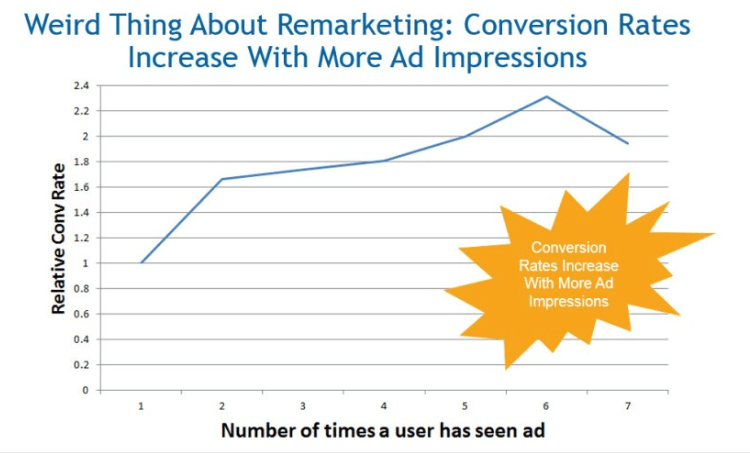
WordStream has found that internet users who saw more remarketing campaigns in fact showed higher levels of conversion rates.
 (Image source: wordstream.com)
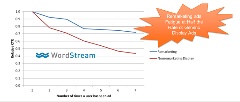
If ads occur too frequently though, or are poorly designed, ‘banner blindness’ or ‘ad fatigue’ can set in, resulting in decreased clicks. However, WordStream’s research suggests that this happens nearly 50% less with remarketing banners than ‘normal’, non-targeted adverts.
 (Image source: wordstream.com)
This is good news for remarketing strategies, suggesting that they have longer positive effects on consumers and clients than generic ads. But there’s more to the story than slower ad fatigue.
What makes good Remarketing?
Like any method of marketing, there are good ways and bad ways of doing it.
The essence of inbound marketing is to provide the best information to the right audience at the perfect time. That’s what great remarketing can do.
There are three fundamental elements to a quality piece of remarketing that all banner retargeting ads should stick to:
- Targeting your audience with the right offer. Displaying the same remarketing ad to every visitor is unlikely to yield the best results. Google Analytics allows you to toggle variables to around 2,000 different audiences. Use the super-personalised nature of remarketing technology to be highly specific. Video ads might perform better in some places and an image in others.
- Use attention-grabbing imagery. As we mentioned, people can easily develop banner blindness. Make your ad noticeable, user-friendly and engaging with good images and attractive design. You may also consider using dynamic ads. They tend to convert well.
- Include a Call-To-Action. You are much more likely to encourage someone to click with a CTA. Make sure to tell them exactly what offer they can get by clicking your button.
Like any advert, the aim is to entice customers to your site. The advantage of remarketing displays is that you can target an audience who are already primed and familiar with your brand.
 Now let’s look at a few examples that show how remarketing can be done really well.
8 examples of Remarketing banners that convert
1. Nike
If you want to see the simplest, most effective example of those three remarketing criteria, you could do little better than this display banner from Nike.
It helps that they have one of the world’s most recognisable company logos. But even without their branded tick in the corner, the ad design is exquisite in its simplicity.
Black text on a plain white background and four neat elements, tell you everything you need to know.
The image of a particular trainer and second person approach of the “SUGGESTED FOR YOU” text show how Nike are specifically targeting you as a consumer who has already been browsing their website for the perfect sports shoe.
The CTA leaves you in no doubt that clicking it will take you directly back to their site to complete your purchase. A thing of remarketing beauty!
2. Frank And Oak
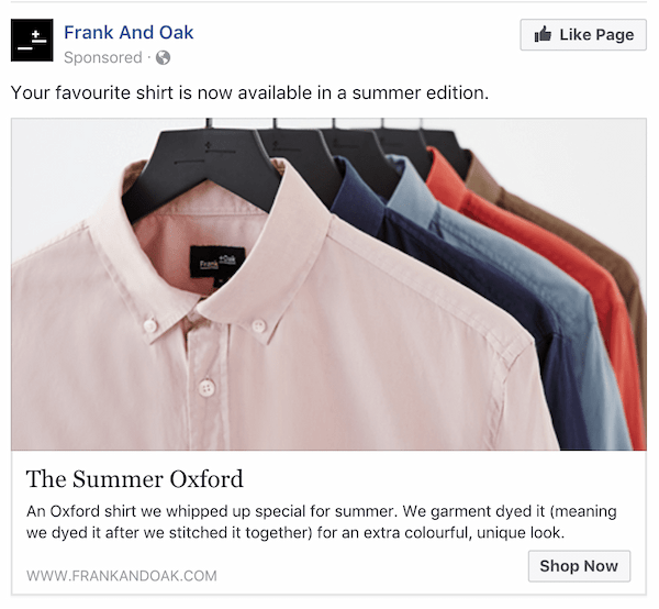
Sticking with clothing, here is another effective ad from a sustainable Canadian fashion brand - this time using the Facebook remarketing pixel.
Again, framing the content in the second person - ‘Your favourite shirt’ - addresses the reader and reminds them of their recent shirt window-shopping with some interesting information about the product in question.
It’s also targeted at a particular season (suggesting a hint of urgency – buy in time for summer) and the variety of shirt colours in the image are attractive. ‘
Shop Now’ is an unambiguous CTA, and they include their full URL at the bottom in case you prefer to type it in later.
It’s worth noting here that remarketing doesn’t have to be aimed at visitors who have come to your site but not made a purchase. It can be just as effective if targeted at customers who have bought from you before, but perhaps been dormant for a while.
Frank And Oak might have set this banner to display for buyers who bought their shirts in, say, the autumn line, and want to encourage them to repeat a purchase from their new season’s offerings.
Remarketing can be an effective way to make use of the leads you have rather than spending more money for new prospect acquisition.
3. Spotify
Music lovers who don’t subscribe to their paid service will be very familiar with these sorts of remarketing ads from Spotify.

While not as personalised as the above examples, this banner does focus on listeners who already use the standard free version of their platform.
The offer is clear and inviting – who wouldn’t want a better service for three months without having to pay anything?
Their colour scheme is bold and eye-catching.
The Spotify logo instantly recognisable by anyone who’s already a Spotify member and the image complements the offer nicely.
A neat CTA and lots of clear space make this an attractive ad, well targeted at existing users.
4. Specsavers
Here is a highly personalised and specific remarketing ad from opticians and eyewear marketing experts, Specsavers.

The writer who was targeted by this banner had visited Specsavers’ website to look for a nearby store for an eye test. This ad makes it really easy for them to do so – with big, bold yellow writing.
One point of contention raised, is that the prospect had already called up to book an eye test over the phone. Specsavers therefore remarketed to her unnecessarily, the pixel unable to track offline conversions.
This is worth remembering You can set the frequency of your remarketing ads, adjusting how often they follow the user around the web. If you do it too much or for too long, it may start to annoy potential customers. Especially in cases such as these when there are offline methods of conversion.
Consider these factors when setting up your remarketing pixel.
5. WatchFinder
As mentioned briefly before, urgency is a powerful messaging method to encourage people to click back to your site. WatchFinder use it subtly in this ad, one of around a dozen they sent out at the same time.

Customers are encouraged to buy and shop ‘now’ in the CTAs and the product images perhaps subconsciously allude to time ticking away.
This campaign by WatchFinder combined remarketing with geolocation, aimed at the London financial district (The Royal Exchange).
Targeting an expensive product to the places where your target audience ‘live’, is a great way of getting your ads in front of the audience who are interested in your products.
6. Allbirds
Back to shoes.
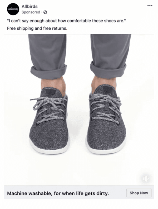
Allbirds use video on this Facebook ad to catch your attention.
Although it’s eye-catching, it’s not over-complicated. It’s short and doesn’t show a lot more than a photo would, but the subtle movement on your Facebook feed just might stop you scrolling to click their CTA button.
(We know it’s an image below, but the video was just too big)…
We also like their first-person testimonial quote about the shoes’ comfort at the top of the ad and (like Nike), generous use of white space, black text and simplicity.
It’s also showing a good, clear offer with free shipping and returns.
That is another helpful takeaway – do more than just give your leads a button to click back to your site. Move them along your sales funnel with something extra. An enticing deal or giveaway that may not have been on offer when they were initially browsing can make the difference between a bounce and a buy.
7 & 8. Naturebox & Oddbox
Lastly, we thought we’d show you a compare and contrast between two similar ads from these two food delivery companies.
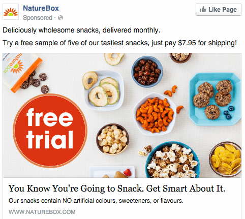
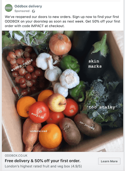
NatureBox delivers snacks while Oddbox delivers fruit and veg.
What’s most obvious is that both ads show delicious looking produce in large, colourful visuals. Remarketing for food is like going to the supermarket when you’re hungry – you’re much more likely to buy if you see the product at a time when you can imagine really enjoying it.
Oddbox cleverly annotates its image with the reasons these fruits and vegetables were rejected by supermarkets. Contrasting their supposedly negative characteristics with their appealing appearance highlights both the quality of the produce and also the company’s sustainable ethos. They won’t throw away perfectly good food and you can help by enjoying it too.
NatureBox make their visuals alluring by setting their snacks up in a delicious spread – literally spilling out onto the table, ready to be eaten.
Both ads contain good offerings – free samples, free delivery, or 50% off first orders are all valuable and clickable.
NatureBox’s large, bold coloured ‘Free Trial’ circle is a great CTA and their copywriting about ‘You know you’re going to snack’ is personable and knowing. They also know you’re going to snack, hence their remarketing ad.
NatureBox and Oddbox both have little extra bits of information in the smaller print, to convert the more reluctant reader who might need slightly more convincing.
Most of all, both these ads demonstrate that your product is your best marketing. Tasty-looking food is enticing enough, and you’re always going to need fruit, veg and snacks.
Remarketing to customers who have been looking for a good deal on their everyday essentials is a powerful, effective tool.
How can Remarketing help in today’s “new normal”?
We hope these examples give you a good idea of the merits of strong remarketing campaigns. Now more than ever, making the most of your site’s bounced visitors is a crucial marketing strategy.
In 2018, 72% of woman and 68% of men were shopping online and that’s only going to continue. Regardless of your industry, the internet is one of the main sources of product research and purchasing.
But with only 4% of people buying on their first look, it’s crucial to follow your visitors with remarketing ads to get them to return to your content.
The Google Display Network (on which you can remarket), includes millions of websites where most internet users are going to be surfing.
We are now all very used to online ads and brands following us as we go about different websites. Both Google and prospects have developed very sharp detectors of ‘bad’ ads that we instinctively ignore, so it’s more important than ever to ensure your remarketing strategy includes highly personalised, targeted and eye-catching display banners.
It’s even possible that consumers in 2020 will deliberately bounce away from websites while browsing for a product in the hope or knowledge that they’ll be followed by a remarketing pixel.
By offering discounts, freebies and reminders, you can make sure you’re staying at the forefront of your audience’s minds – even when they’re checking out the competition
Over to You
As part of a well-thought-out inbound marketing and digital marketing strategy in general, remarketing can be a hugely effective tool. An inbound marketing agency will know how to create effective ads and help set up your remarketing pixels to deliver the best results.
Get creative with your banners and target them to your ideal audience and start seeing those bounced visitors come bouncing back.
