Although the business-to-business or B2B industry is currently estimated at $6.7 trillion, business organisations that sell products or services to other businesses need to tread carefully and take a strategic approach in how they generate leads and communicate their value proposition to prospective clients. In a digital marketplace saturated with options, prospective customers are relying on their own initiative and the impressions that they get of B2B businesses to guide their purchasing decisions. For this reason, B2B website design – and the way this design communicates a company’s purpose and intent in creating and sustaining customer relationships – is now of huge importance.
Why B2B Website Design Matters
According to research by Google, 89% of B2B researchers gather information about potential purchases through the internet. What’s more, prior to interacting with a B2B website, the average B2B buyer conducts 12 different online searches. In a crowded arena, this puts the onus on B2B business organisations to first establish their relevance to prospective customers through high-ranking placements on search engine keyword listings, and to then go on to effectively communicate and make good on their value proposition via a well-designed B2B website, with other pages, content, and resources that speak to the needs and issues of prospective buyers.
Given the number of competing business organisations in the B2B market, effective brand positioning and differentiation from what other businesses have to offer are extremely important. In fact, HubSpot research reveals that in 2022, roughly half of B2B marketers report that 'increasing brand awareness' is their number one goal. A corporate web design that provides both eye catching visuals, and does an excellent job of getting across your value proposition, can play a critical role in this brand positioning strategy.
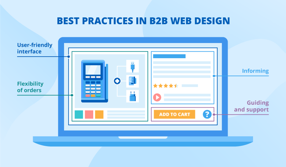
[Image source: ScienceSoft]
Here are six web design tips and strategic recommendations for making your B2B website a positive asset.
1. Know Your Target Audience
Good web design for B2B begins with knowing who your target customers are, and what their desires, aspirations, and pain points are. Market research and the creation of accurate buyer personas can assist the owners and creators of B2B websites in developing a beautifully designed B2B website with a clear message that resonates with customers.
Learn more about how to use social proof in your inbound marketing website design
2. Keep it Clean and Clear
With attention spans in the internet era down to seconds or less, your B2B website has only a very short time to create a good impression with visitors before they decide to stay or leave. For this reason, B2B websites built on the basis of functional minimalism are ideal for website visitors in today’s environment. Such minimalist design relies on clear and concise messages, coupled with the judicious use of eye catching visuals, and plenty of white space. This website image from the HubSpot Customer Relationship Management (CRM) platform is a great example:
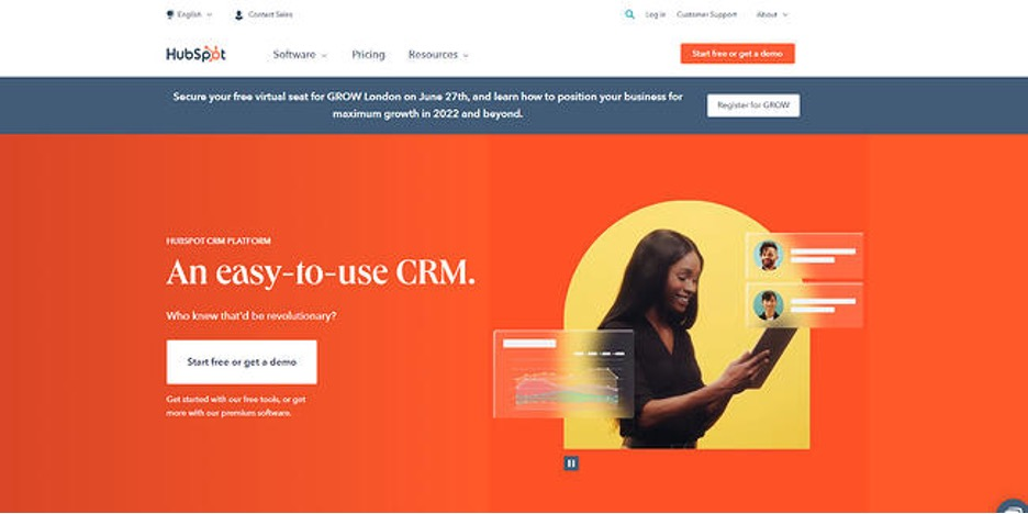
[Image source: HubSpot]
This white space serves to separate web design elements so that visitors can clearly focus on them in turn. It also acts as an informal guide to prospective customers as they visually navigate your B2B website.
A minimalistic approach to your web design and user friendly layout to your website home page, product landing page, and other pages also puts less stress on the user, in terms of the time it takes your B2B website to load. Little surprise then that HubSpot research indicates that over half of B2B marketers say 'optimising load speed' is going to be their most effective Search Engine Optimisation (SEO) strategy in 2022.
3. Optimise Your B2B Website for Mobile Devices
These web design considerations also apply to the loading and viewing of B2B websites on mobiles and tablets – an avenue favoured by increasing numbers of visitors looking to source products and services for their companies or business organisations.
A mobile friendly B2B website should be easy to understand and navigate, with a responsive web design that includes clear and legible text, and prominent design elements such as the call to action button that leads visitors on to the next stage on their journey to becoming paying customers.
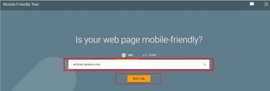
Google provides a free tool to help you establish how friendly your website is to mobile device users.
[Image source: Google]
The Mobile-Friendly Test also displays a real-time example of what your website page looks like on a mobile device.
4. Design Your B2B Website with Social in Mind
The same HubSpot research reveals that 75% of B2B clients and 84% of C-Suite executives of companies making B2B purchases use social media when contemplating a buy. So it makes sense to integrate your B2B website with popular B2B social media platforms like LinkedIn and Facebook. There are a number of marketing automation tools available, to facilitate seamless integration into social media.
5. Establish Yourself as an Authority or Thought Leader
Besides the value proposition of your products or services, another way of converting visitors to your B2B website into paying customers is by instilling a sense of confidence in them, and establishing your company as a trusted advisor, industry thought leader, and/or resource base.
You can do this by consistently delivering quality content, information, and services. These may take various forms, such as blog posts, white papers, eBooks, webinars, or free downloads. Remember to provide clear instructions and a highly visible call to action button, to assist visitors in website navigation, and to help you gather useful contact information that can generate leads.
6. Take a Customer-Centric Approach to B2B Website Design
Finally, rather than directly pitching your products and services, your B2B website should take a customer-centric approach to communicating your value proposition. Think about how your target audience defines itself, and which aspects of your customers’ identity most affects the way they look at your own company.
Wherever possible, provide opportunities for customers to share something about who they are and what they’re looking to do on your website. You should also use language on your B2B website that is directly relevant to visitors, in terms of the business objectives of their company, and the outcomes they are looking to achieve.
Your brand promise and brand positioning will be important factors in shaping all of this.
Here at Incisive Edge, we know that every customer is different, and every positioning project produces a totally unique proposition. We will work with you to define detailed Buyer Personas for your target audience’s decision makers. We will craft a value proposition that emphasises why you are unique and the value you provide your target market – and help you communicate this in visual terms.
If you’d like to know more about how Incisive Edge can help you create a successful B2B website, get in touch with us.
