

Google acts as the gatekeeper between your potential customers and your website. From ranking search results to selling ads and offering tools to analyse user activity - Google controls almost everything.
And March 2021 saw the 100% rollout of mobile-first indexing, adding yet another factor for companies to navigate.
The initial rollout date was scheduled for September 2020, but was pushed out due to the COVID-19 pandemic and the uncertainties caused.
Mobile-first indexing was explored by Google in late 2016 as a reflection of internet habits migrating towards handheld devices, and it has been a hot issue in the SEO world ever since. As the mobile audience increased, so did Google's interest in accommodating user behavior by prioritising mobile versions of every site in its algorithm.
What is Mobile-First Indexing?
No explanation could be better than the explanation provided by Google itself: “Mobile-first indexing means Google predominantly uses the mobile version of the content for indexing and ranking. Historically, the index primarily used the desktop version of a page’s content when evaluating the relevance of a page to a user’s query.”
Simply said: because the vast majority of searches are conducted on mobile devices, Google is catering to its user base by rewarding websites that deliver an excellent mobile user experience.
When Google bots explore your site, they'll go to the desktop and mobile versions first. What they find on both versions will impact your search ranking. Monitoring crawl bot traffic may reveal an increase in traffic from both mobile pages and the smartphone agent in the future, indicating changes in mobile indexing.
However, mobile-first indexing does not imply that there will be separate indexes for mobile and desktop. Google will retain a single search index. The difference is that in order to rank sites, its algorithms will now focus on the mobile version of the material.
Check out the following articles to learn more about b2b optimisation:
- 6 Tips To Create a Successful B2B Website
- Website Optimisation: How to Build a Digital Lead Funnel
- B2B lead generation guide: how to get more leads
Mobile-First for B2B Brands
According to Statistica, mobile devices accounted for 52.2% of total internet traffic in 2018. This is a dramatic increase from 2015, when mobile traffic accounted for 35.1% of total traffic, another huge jump from 10.7% in 2012.
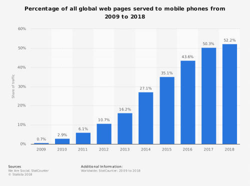
Image Source: Statistica
The global average is 52.2%, however the figure varies greatly depending on which country you're looking at.
Statistica segregates mobile website traffic based on geography. In April 2018, mobile devices accounted for 65.2% of total online traffic in Asia, and 63.9% in Africa.
Comparatively, mobile accounts for 39.6% of internet traffic in North America and just 37.4% in Europe.
This is a massive gap, so while mobile is essential, it is not as dominant as some statistics would suggest - at least not in North America and Europe.
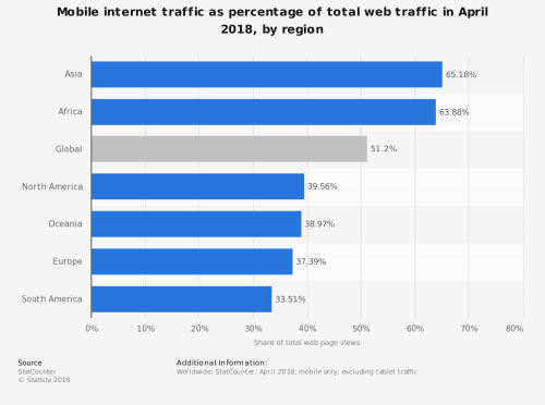
Image Source: Statistica
For B2B businesses, the mobile-first premise skews even further.
Take a look at your day-to-day activities: how much time do you spend at work looking up professional websites on your phone?
Office workers use both the mobile and desktop versions of different sites for tasks like email, presentations, video calls, and programming. This impacts their online experience. The mobile search results displayed on their mobile pages must be consistent with every other version.
Office employees use their mobile devices frequently, but are they using them to research and purchase B2B products?
Digging through your Google Analytics over the previous 12 months is an excellent exercise, allowing you to answer these questions:
- What percentage of your site's visitors came from a mobile or tablet device?
- What time of day do your website's visitors visit?
Many B2B companies are surprised to learn that between 9 a.m. and 5 p.m., 80% or more of their website traffic originates from desktop computers.
Unfortunately, while your clients may not be connecting with your brand first on mobile, that doesn't mean you should ignore it.
Google operates on a mobile-first basis, which means that if you want your website to rank high in Google's search results, it must provide a superb mobile experience.
Prospects are also assessing your brand across numerous platforms. Customers may spend the majority of their time looking at your website from a desktop computer for B2B businesses, but that doesn't mean they won't look you up from their phone or tablet as well.
Mobile-First Indexing Best Practices to Implement
So, no matter how much of your traffic is actually coming from mobile, mobile-first indexing is here to stay.
But how do you optimise your website to ensure that you retain your rankings going forward?
One answer is to use responsive web design and make sure your website looks the same on all devices. If necessary, you may have to invest in rebuilding your website.
And it’s good to know that you won't have to develop separate versions of your website for different devices if you choose a responsive design.
Many companies claim that the mobile version of their website needs less material than the desktop version. While the logic behind this is valid in terms of improving the user experience for mobile users, eliminating material that was engaging your visitors will only damage your SEO in the long run.
Instead of eliminating material, consider “hiding” anything beyond the first two or three paragraphs and including a “read more” or “expand” option.
Secondly, you need to verify that Googlebot has access to your content.
Simply put, Google cannot send you traffic or conversions if it cannot access and understand your website.
The following are important considerations for your mobile website:
- On all your mobile and desktop sites, use the same meta robots tag. The “noindex, nofollow” tag is a major one to look for since it might entirely prevent your mobile site from being indexed.
- Don’t lazy load any user material that needs interaction.
- You need to make sure that your robots.txt file doesn't prevent any pages from being crawled.
- Examine how pictures and visual content display on mobile devices.
Having clear and high-quality pictures available for both the mobile and desktop site is vital for providing a positive experience. On a product page, for example, the more detail a user can see on their mobile device just by looking at the image, the more likely they are to interact by spending time looking at the photos and potentially making a purchase. Ensuring a seamless experience and avoiding mobile errors contributes to better user engagement.
Use an image format that is supported. For example, Google has confirmed that jpg pictures in the images> element within an inline SVG cannot be indexed by their systems.
- Have you checked your structured data?
To begin, make sure that your mobile and desktop pages both have the same structured data.
- Another important consideration is to utilise the right url in the structured data.
- And finally, don’t forget to check your videos content settings.
You want to make sure that videos uploaded to a page don't mess with the format of your mobile website, much like photos.
One of the most important things to check is to ensure that your video urls do not change every time the website loads. The organic performance of the page could be severely harmed as a result. Putting the videos in an easy-to-find location on the mobile version of the page is another important aspect of mobile site optimisation.
Once you have made all the checks listed above, use a tool such as Google Search Console to check your mobile friendly score. Ensure that you conduct crawls using SEO tools using both the desktop and mobile agents to detect any differences.
Running a couple of crawls on your website is one of the greatest ways to discover all of the major adjustments you'll need to make on your mobile website and there are a number of SEO tools you can use for this. Compare the results from your mobile site to those from your desktop site, and ensure that any faults with the mobile site are addressed first.
If you're creating a website from scratch, concentrate on the mobile version as while desktop should definitely be a consideration, it is now secondary.
While you still want your desktop visitors to have a positive experience, prioritising your mobile page and ensuring mobile usability guarantees that you won't lose a significant amount of valuable SEO traffic. Both desktop versions and mobile sites play a crucial role in attracting and retaining users.

